pickleball logo
Creating a visual identity for your pickleball team or club is almost as exciting as that first perfect dink over the net. Whether you are starting a local league in your neighborhood or branding a serious competitive club, your logo is the flag you fly. It’s what opponents see on your jerseys before the match begins, and it’s the badge of honor your members wear on their hats.
If you’re diving into pickleball logo design, you might feel a bit overwhelmed by the choices. Should it be funny? Serious? sleek? Don’t worry—we’re going to walk through this together, just like we’re chatting on the sidelines between games.
Identity & Style
Your logo is the face of your team. It needs to say a lot without using many words. Let’s break down the creative choices that will define your look.
What makes a pickleball logo stand out from the competition?
The best pickleball logos aren’t just pretty pictures; they are memorable storytellers. Think about the brands you love—their logos are usually simple, bold, and easy to recognize even from a distance. In the world of pickleball, where everything moves fast, you want a design that is instantly readable.
A standout logo often avoids the clutter. Instead of trying to cram a paddle, a ball, a net, and the city skyline into one image, the most effective pickleball club logos focus on one strong element. Maybe it’s a stylized paddle that incorporates your team’s initial, or perhaps it’s a dynamic swoosh that suggests the movement of the ball. The key is “distinctiveness.” If you put your logo next to five others, yours should be the one that people remember because it has a clear, confident personality.
Should I use a “pickle” mascot or stick to equipment iconography?
This is the classic debate! And honestly, the answer depends entirely on your team’s vibe.
If your group is all about fun, social weekends, and maybe a post-game beverage, a mascot can be a fantastic choice. A “pickle” character—maybe wearing a sweatband or swinging a paddle—immediately tells people, “We take the game seriously, but we don’t take ourselves too seriously.” Mascots build emotional connections and are great for merchandise.
On the other hand, if you are forming a high-performance academy or a competitive league, you might want to stick to equipment iconography. Sleek, geometric renditions of paddles and balls convey professionalism, precision, and speed. For example, a club like Logan Square Pickleball might lean towards something modern and urban to reflect their location, rather than a cartoon character. Equipment icons tend to look more “varsity” and athletic, which commands a different kind of respect on the court.
What color psychology works best for sports branding?
Colors speak louder than words. When choosing your palette, you aren’t just picking your favorite shades; you are picking an emotion.
- Blue: This is the color of trust, focus, and calm. It’s incredibly popular in sports because it suggests a team that is disciplined and strategic.
- Red: High energy, aggression, and passion. If your team style is fast and fierce, red gets the heart racing.
- Yellow/Neon Green: These are the native colors of pickleball! They scream energy and visibility. Using neon accents can make your branding feel authentic to the sport.
- Black & Silver: innovative and intimidating. These colors suggest a modern, elite squad.
A pro tip for pickleball logo design: Ensure high contrast. A neon green ball looks great on a navy background, but it might disappear on white. You want your logo to pop whether it’s on a dark jersey or a white flyer.
How do I design a logo that looks good on both a website and a jersey?
This is where “versatility” becomes your best friend. A logo might look like a masterpiece on a 27-inch monitor, but does it turn into a smudge when it’s embroidered on the chest of a polo shirt?
To ensure it looks good everywhere, aim for a design that works in a “responsive” way (more on that in the technical section). Avoid thin, wispy lines that will disappear when printed small. Also, test your logo in black and white. If it relies entirely on color to make sense (like a red ball on a green paddle that merges into grey mud when printed in black and white), you need to rethink the contrast. A great logo has strong “bones”—good shapes that work regardless of the medium.
Technical Specs
Okay, let’s put on our technical hats for a moment. You don’t need to be a graphic designer to understand this, but knowing these basics will save you a ton of headaches (and money) later.
Why are Vector (SVG) files non-negotiable for sports team logos?
Imagine you take a photo with your phone and zoom in really close. It gets blocky and blurry, right? That’s because it’s made of pixels (like a mosaic). Those are called “raster” images (JPEGs, PNGs).
“Vector” files (like SVGs, AIs, or EPSs) are different. They are made of math—geometric formulas that describe lines and curves. This means you can stretch a vector logo to the size of a billboard, or shrink it to the size of a postage stamp, and the lines will remain razor-sharp.
For sports teams, this is non-negotiable. Your jersey printer needs a vector file to cut the vinyl or burn the screen for printing. If you send them a blurry JPEG, they will likely charge you a “digitizing fee” to recreate it, or worse, print a blurry logo. Always ask your designer for the vector source files.
How do I create a “responsive” logo that scales down to a paddle handle?
Responsive design isn’t just for websites. It means your logo can adapt to different spaces.
Think of it like a Russian nesting doll.
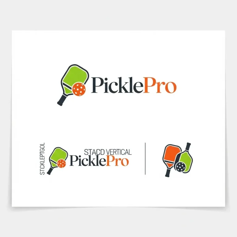
- The Full Logo: This has the icon, the team name, and maybe a slogan. Great for the back of a jacket or a website header.
- The Stacked Logo: The icon sits on top of the text. Good for jersey chests or shoulders.
- The Icon/Mark: Just the symbol (the paddle, the mascot face). This is what you put on a tiny sticker on the handle of a paddle, or as your Instagram profile picture.
When commissioning pickleball logos, ask for these variations. It ensures you never have to force a wide, complex logo into a tiny, square space.
What is the best file format for embroidery on hats and polos?
Embroidery is a physical process where needles stitch thread into fabric. Machines can’t read a JPEG or even a standard Vector file directly; they need a specific “digitized” file that tells the needle where to poke (often formats like .DST or .PES).
However, you generally don’t create these files yourself. You provide the Vector (EPS or AI) file to the embroidery shop. Their software uses the clean vector lines to map out the stitch path. If you give them a high-quality vector file, the resulting embroidery will be clean and crisp. If you give them a low-quality image, the machine has to guess, and you end up with messy, unreadable text on your expensive hats.
Niche: Usage & Strategy
You have a great design. Now, how do you use it smartly without breaking the bank or getting into legal trouble?
Does the number of colors in my logo affect printing costs for team gear?
Yes, it definitely can, especially if you are using traditional screen printing.
In screen printing, every color in your logo requires a separate “screen” (stencil) and a separate run of ink. A 4-color logo requires four screens and four setups. A 1-color logo requires only one. If you are ordering 50 jerseys for your league, a 5-color logo could cost significantly more per shirt than a 2-color one.
However, if you are using “Direct to Garment” (DTG) or sublimation (which dyes the fabric directly, common in activewear), the color count often doesn’t matter as much because it prints like an inkjet printer. But for things like screen-printed cotton tees or tote bags, keeping your color count low (1-3 colors) is a smart financial move.
What are the standard logo placement rules for tournament jerseys?
You want to look like a pro, so you should follow the pro standards.
- Left Chest: This is the home of the heart, and consequently, the home of your team’s primary logo. It should be about 3 to 4 inches wide.
- Full Front: If you want to make a statement, the team name or a large version of the logo can go across the chest. This is less common for competitive match play (where breathable fabric is key) but great for warm-up tees.
- Sleeve (Right or Left): This is often reserved for the American flag (or your country’s flag) or a sponsor logo.
- Upper Back (Yoke): The area right below the collar on the back is perfect for a small club icon or a league logo.
- Center Back: Usually reserved for player names and numbers.
If you look at successful local clubs, like the community around Logan Square Pickleball, you’ll often see they mix functionality with style—placing logos where they are visible but don’t interfere with the breathability of the jersey during a sweaty match.
How can I safely check if my logo idea is too similar to existing pro teams?
The last thing you want is a Cease and Desist letter because your logo looks exactly like the Major League Pickleball team’s branding.
- Reverse Image Search: Take your logo concept and drop it into Google Images. See if anything strikingly similar pops up.
- USPTO Search: You can search the United States Patent and Trademark Office database for free. Search for keywords related to your logo elements (e.g., “pickleball paddle sun logo”).
- Common Sense & Industry Research: Look at the logos of the big leagues (MLP, PPA). If your logo uses the exact same color scheme and a very similar mascot to a famous team, you are in the danger zone.
It’s always better to be unique. Not only does it avoid legal trouble, but it also helps you carve out your own identity in the growing world of pickleball.
Designing a logo is the first step in building a community. It gives your players something to rally behind and something to wear with pride. Whether you go for a goofy pickle mascot or a sleek, futuristic paddle icon, make sure it represents you. Keep it simple, keep it scalable, and most importantly, get it out on the court!